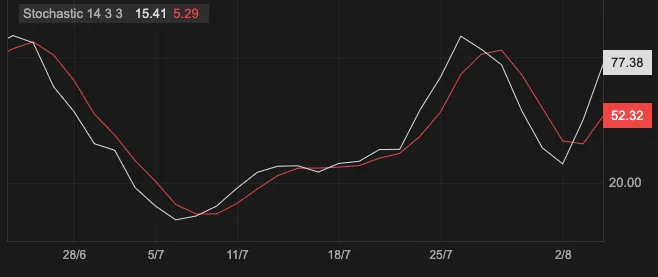
Jul 5, 2026 · 10 min read · Intro I Built react-candlesticks: A Zero-Dependency React Chart Library for Trading UIs A Canvas-powered, React-composable candlestick chart library for stock dashboards, crypto tools, watchlists, backtesting views, and financial analytics UIs. Read article →
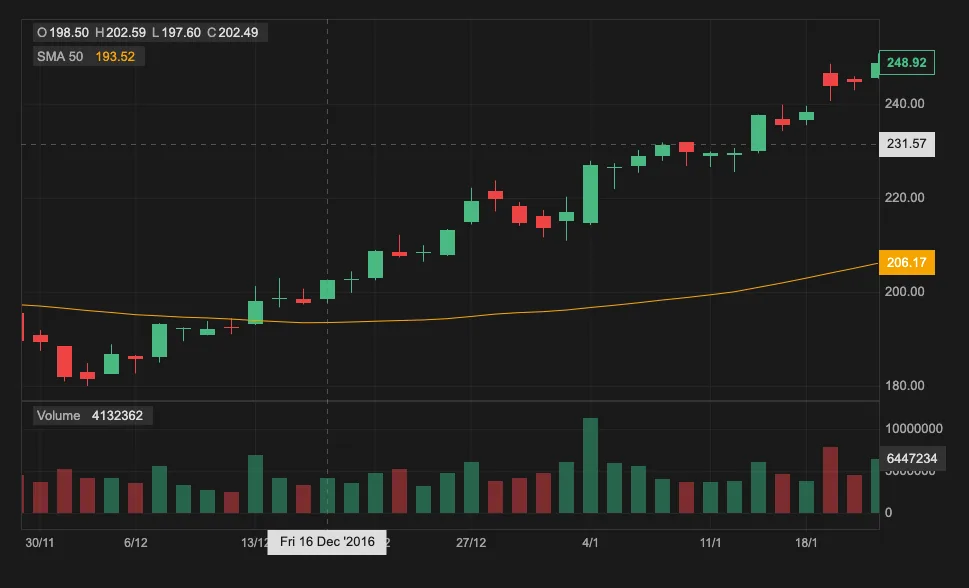
Jul 2, 2026 · 6 min read · Guides Use a React Candlestick Chart in Next.js Build an interactive React candlestick chart in Next.js with volume bars, SMA overlays, a Stochastic indicator, and light and dark themes. Read article →
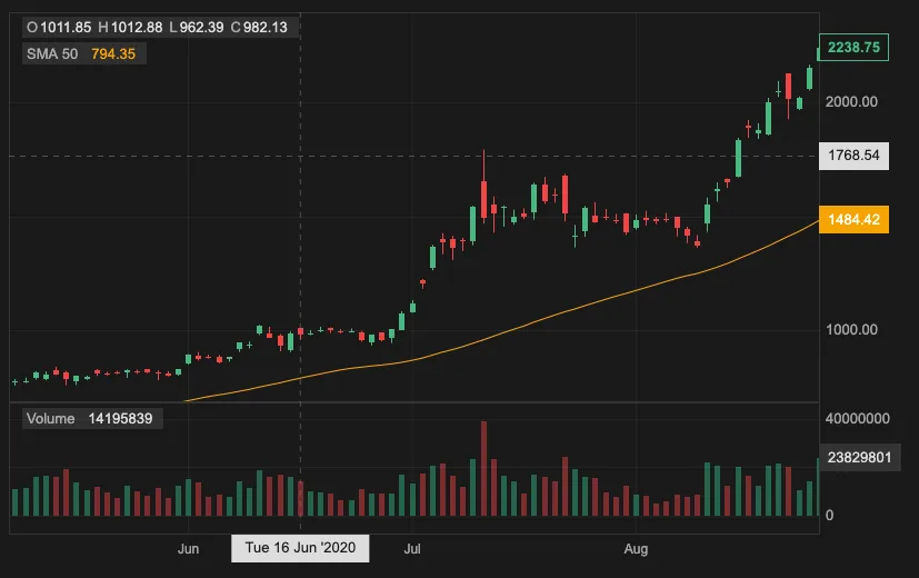
Jun 29, 2026 · 9 min read · Guides Build a Crypto Price Chart in React Fetch free crypto OHLCV data and build a React crypto chart with granularity controls, chart type switching, volume, and removable indicators. Read article →
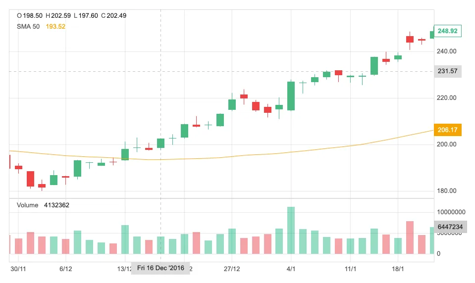
Jun 7, 2026 · 7 min read · Guides Build a React Candlestick Chart with Volume and Indicators Build a React candlestick chart that visualizes OHLC data with volume bars, indicators, crosshairs, zoom, and dark mode using react-candlesticks. Read article →
'/%3e%20--%3e%3cg%20transform='rotate(22.5,%2040,%2040)%20translate(0,%20-6)'%3e%3cpath%20d='%20M%2058%2014%20H%2050%20A%203%203%200%200%200%2047%2017%20V%2029%20A%202%202%200%200%201%2045%2031%20H%2036%20A%203%203%200%200%200%2033%2034%20V%2042%20A%202%202%200%200%201%2031%2044%20H%2022%20A%203%203%200%200%200%2019%2047%20V%2064%20A%203%203%200%200%200%2022%2067%20H%2030%20A%203%203%200%200%200%2033%2064%20V%2063%20A%202%202%200%200%201%2035%2061%20H%2044%20A%203%203%200%200%200%2047%2058%20V%2057%20A%202%202%200%200%201%2049%2055%20H%2058%20A%203%203%200%200%200%2061%2052%20V%2017%20A%203%203%200%200%200%2058%2014%20Z%20'%20fill='%23e8a030'%20/%3e%3c!--%20%3cpath%20d='%20M%2064%2014%20H%2052%20Q%2049%2014%2049%2017%20V%2029%20Q%2049%2031%2047%2031%20H%2033%20Q%2030%2031%2030%2034%20V%2042%20Q%2030%2044%2028%2044%20H%2015%20Q%2012%2044%2012%2047%20V%2064%20Q%2012%2067%2015%2067%20H%2027%20Q%2030%2067%2030%2064%20V%2063%20Q%2030%2061%2032%2061%20H%2046%20Q%2049%2061%2049%2058%20V%2057%20Q%2049%2055%2051%2055%20H%2064%20Q%2067%2055%2067%2052%20V%2017%20Q%2067%2014%2064%2014%20Z%20'%20fill='currentColor'%20/%3e%20--%3e%3c!--%20%3cpath%20d='%20M%2061%2014%20L%2047%2014%20L%2047%2031%20L%2033%2031%20L%2033%2044%20L%2019%2044%20L%2019%2067%20L%2033%2067%20L%2033%2061%20L%2047%2061%20L%2047%2055%20L%2061%2055%20Z%20'%20fill='black'%20/%3e%20--%3e%3c!--%20%3cpolygon%20points='%2067,14%2049,14%2049,31%2030,31%2030,44%2012,44%2012,67%2030,67%2030,61%2049,61%2049,55%2067,55%20'%20fill='currentColor'%20/%3e%20--%3e%3c!--%20%3cpolygon%20points='%2061,14%2047,14%2047,31%2032,31%2032,44%2019,44%2019,67%2032,67%2032,61%2047,61%2047,55%2061,55%20'%20fill='currentColor'%20/%3e%20--%3e%3c/g%3e%3c!--%20%3cpath%20d='%20M7,49%20A3,3%200%200%201%2010,46%20L26,46%20A3,3%200%200%200%2029,43%20L29,31%20A3,3%200%200%201%2032,28%20L48,28%20A3,3%200%200%200%2051,25%20L51,10%20A3,3%200%200%201%2054,7%20L70,7%20A3,3%200%200%201%2073,10%20L73,55%20A3,3%200%200%201%2070,58%20L54,58%20A3,3%200%200%200%2051,61%20L51,67%20A3,3%200%200%201%2048,70%20L32,70%20A3,3%200%200%200%2029,73%20L29,79%20A3,3%200%200%201%2026,82%20L10,82%20A3,3%200%200%201%207,79%20Z%20'/%3e%20--%3e%3c!--%20%3cpath%20d='%20M7,49%20A3,3%200%200%201%2010,46%20L21,46%20A3,3%200%200%200%2024,43%20L24,31%20A3,3%200%200%201%2027,28%20L38,28%20A3,3%200%200%200%2041,25%20L41,10%20A3,3%200%200%201%2044,7%20L55,7%20A3,3%200%200%201%2058,10%20L58,55%20A3,3%200%200%201%2055,58%20L41,58%20A3,3%200%200%200%2038,61%20L38,67%20A3,3%200%200%201%2035,70%20L27,70%20A3,3%200%200%200%2024,73%20L24,79%20A3,3%200%200%201%2021,82%20L10,82%20A3,3%200%200%201%207,79%20Z%20'/%3e%20--%3e%3c/svg%3e) Quick Start
Quick Start